Data visualization
Data visualization. We run into a lot of data these days. It’s not easy to process this much information, even explaining it to an audience, whether they are knowledgeable or not. For this reason, we turn to tools like tables, charts, and graphs so that we can present everything easily and effectively.
Today, we’ve brought you 30 different forms of data visualization for you to understand and see when to use which tool to display the available information. Presented in a simple, beautiful and understandable way.
Bar and column charts
Perhaps the most common types of data visualizations are bar and column charts. We see these visual charts everywhere. Research reports, market reports, and analyses are just a few of the many places.
Both column and bar charts show the same data, just one is vertical and the other is horizontal. Consider using either when it comes to showing changes over a given time period or when you want to answer the question of “how many?”.
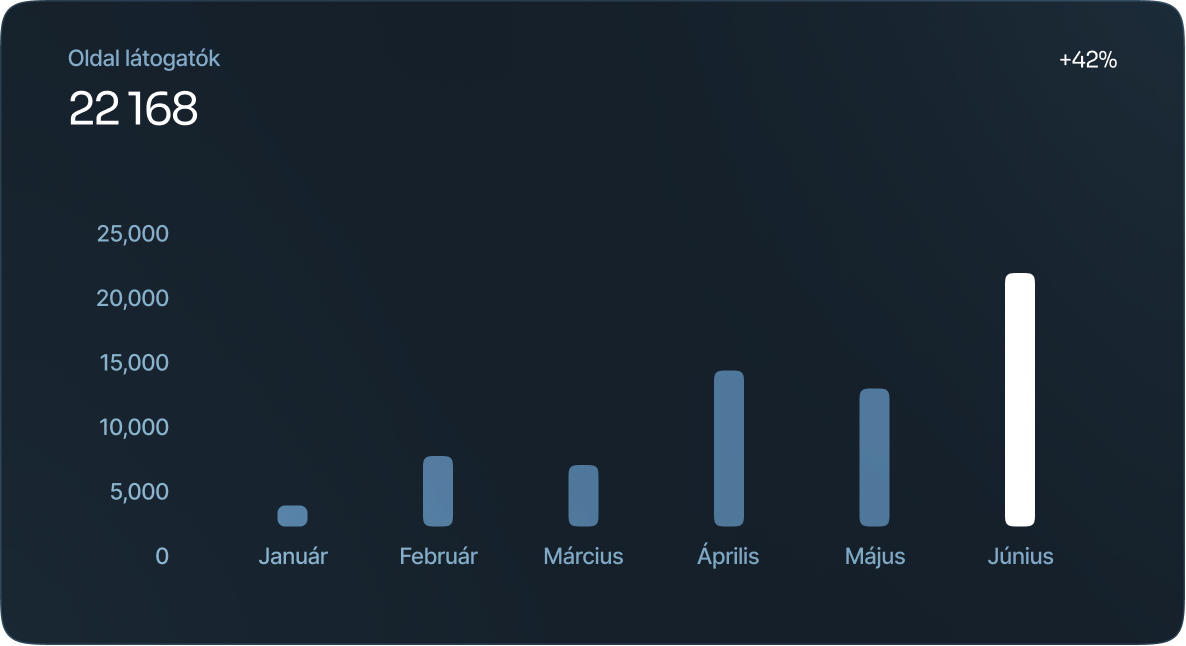

Table charts
A table chart is when data is arranged in rows and columns. This common type of data visualization is often used through data analysis, print media, computer software, simple handwritten notes, and more. It is one of the most basic and effective ways to show data.

Histogram
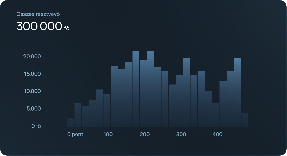
Histograms refer to a graphical representation that displays data using bars to show the frequency of numerical data. Bar graphs are a pictorial representation of data that uses bars to compare categories of data.
Population pyramid
They display two back-to-back histograms (one for each sex) that show the population and how it’s distributed based on age groups in both sexes.
This type of data visualization is ideal for pinpointing changes or differences in the population of specific groups.

Box and whisker plot
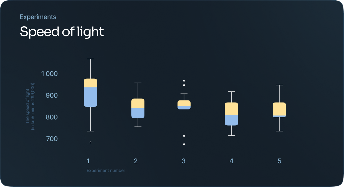
This a way to show data distribution as it moves through quartiles, which are dividers within the data points that segment them into four more or less equal parts.
The lines that extend parallel from the boxes indicate variability outside the upper and lower quartiles.
Radial bar chart
This a way to show data distribution as it moves through quartiles, which are dividers within the data points that segment them into four more or less equal parts.
The lines that extend parallel from the boxes indicate variability outside the upper and lower quartiles.
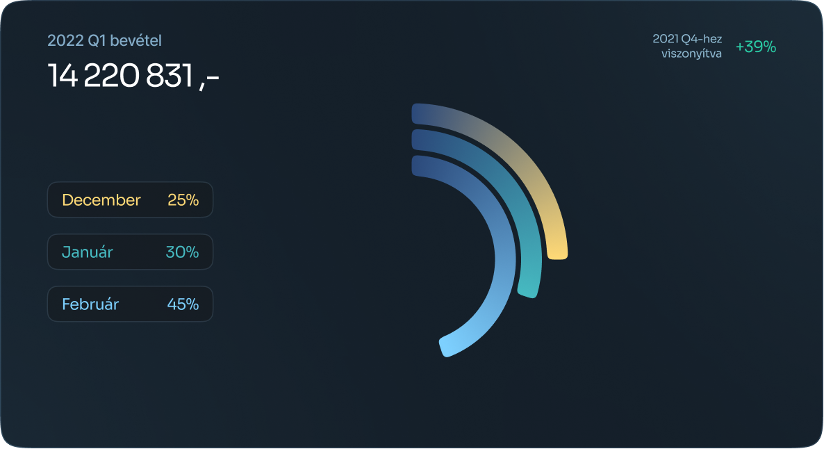
Radial column chart
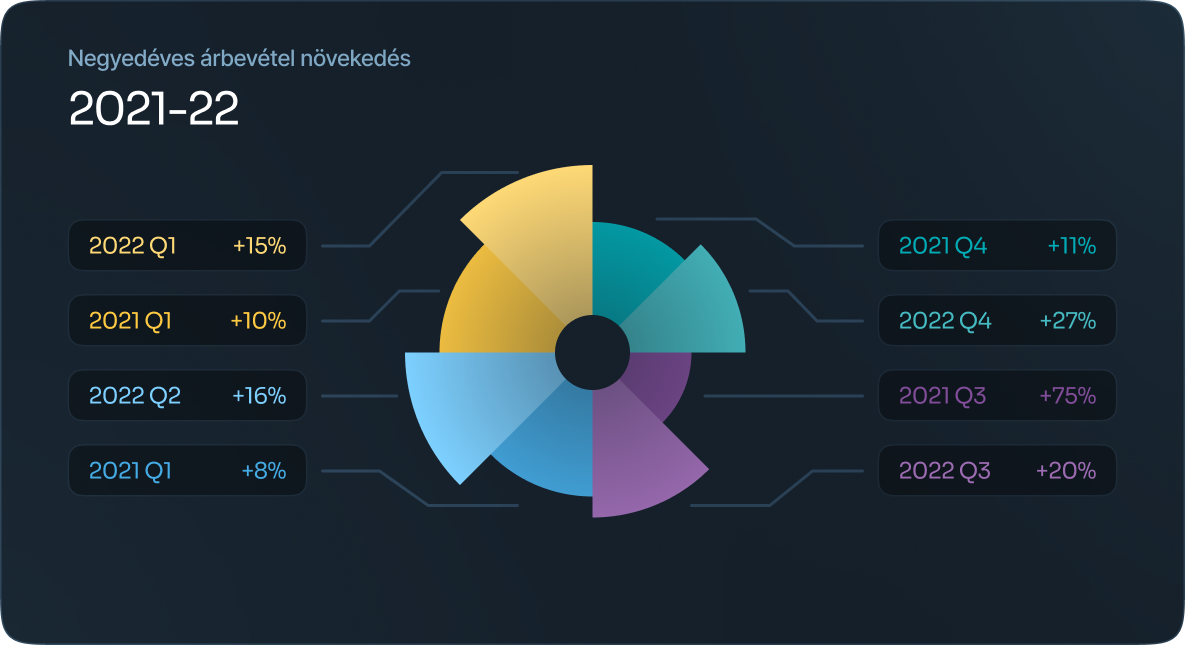
Each circle represents a value on a scale, while also using radial dividers and lines coming out from the center of the chart. These dividers and lines are used to to signify specific categories or intervals within the data.
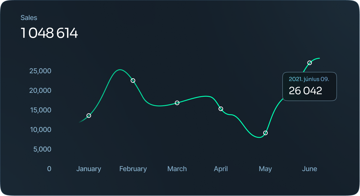
Line chart
These can also be used to show lengths of time, however, they’re a better fit for showcasing potential trends or projections. Typically, the x-axis is a period of time and the y-axis is a quantity.
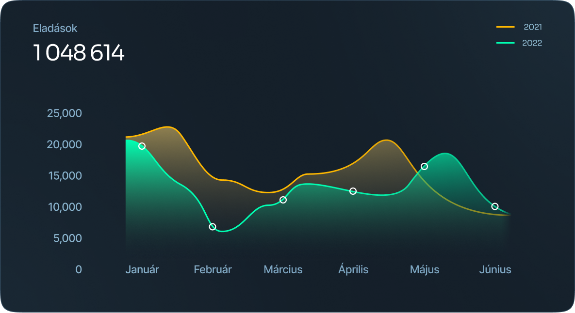
Area chart
An area chart is a version of a line chart where the area under the line is filled in to signify emphasis..
Scatter plot
Scatter plots are great for many data points and highlighting any anomalies or outliers.
How the points appear on the graph are going to show various elements regarding the data.

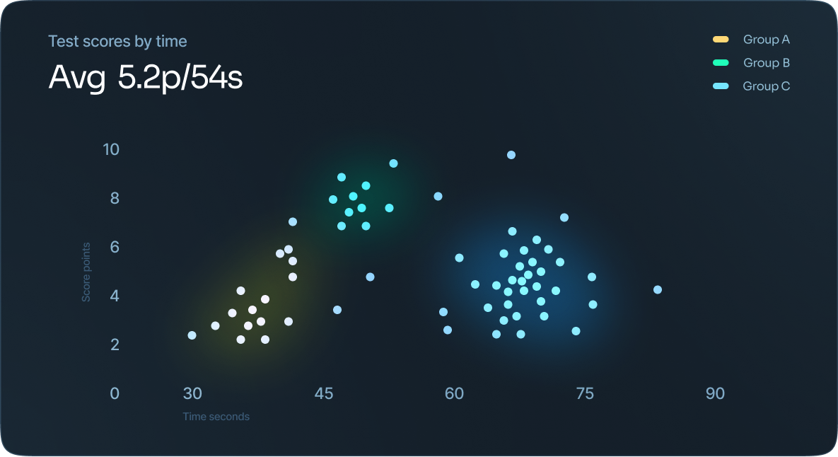
Cluster Analysis
Cluster analysis, or clustering, groups large quantities of data together based on their similarities. Data that is sporadically laid out on a chart can be grouped in strategic ways through cluster analysis.
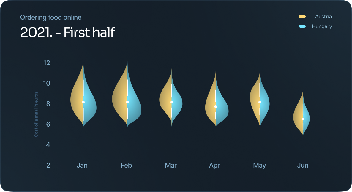
Violin plot
Essentially, it’s a density plot that is placed on its side to show the distribution shape of data.
The dot in the middle signifies the media value and the thick black bar in the middle represents the interquartile range.
Stem and leaf table
A stem and leaf plot table is a type of data visualization where each data value is split into a “stem” (the first digit or digits) and a “leaf” (usually the last digit). As an example, a numerical value where the stem is 2 and the leaf is 1, the number will be 21.

Stream graph
These are best used when studying relative proportions of a whole. The size of each individual shape or stream is proportional to the values in each category. The axis that runs parallel is used to show a time scale.

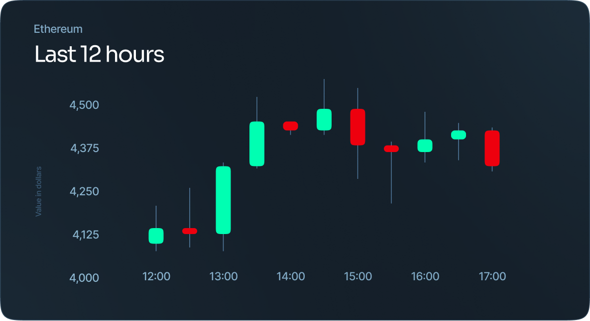
Candlestick chart
A candlestick chart is used as a trading tool to show and analyze the price movements over time. As far as their display, they show price information, like open price, close price, highest price, and lowest price.
Open-high-low-close chart
Like the candlestick chart, OHLC chart is used as a trading tool to show and analyze the price movements over time. As far as their display, they show price information, like open price, close price, highest price, and lowest price.

Kagi chart
These charts are made up of vertical lines that reference the action of the stock’s price, rather than anchoring to a specific time in which the stock was at a specific price.
When a line turns from thick to thin, this is a sell signal that the Kagi line has fallen below a previous low.

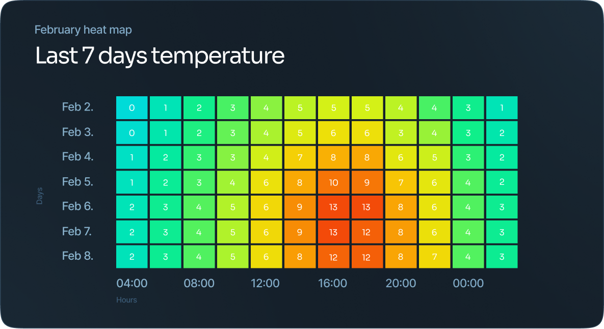
Heat map
Specific formula is used to color each cell, and the areas within the map are colored or shaded to represent a specific value.
Heat maps are best used when visualizing a variable across a matrix of data, like a timeframe of days or hours. The different shades make it easy to see the extremes within the data.
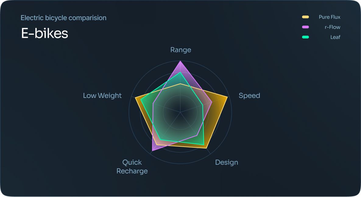
Radar chart
Each observation is represented by its own polygon, making it easy to see any overlap in data.
It’s best to use a radar chart when you have a large number of variables and are looking for a quick way to see quality data.
Tree diagram
A tree diagram utilizes a tree-like structure to show hierarchy within data and is typically used as a data mining technique.

Venn diagram
Sometimes also referred to as a set diagram, each set of data is represented within a circle. The intersection area is where the circles overlap, which means the two sets have something in common.

Network diagram
A network diagram, sometimes called a node-link diagram, shows how things are interconnected using nodes and link lines to represent the connections. This makes it easier to visualize the type of relationships a group of entities may have. In this type of diagram, a note is represented by a circle and the links are drawn using lines.

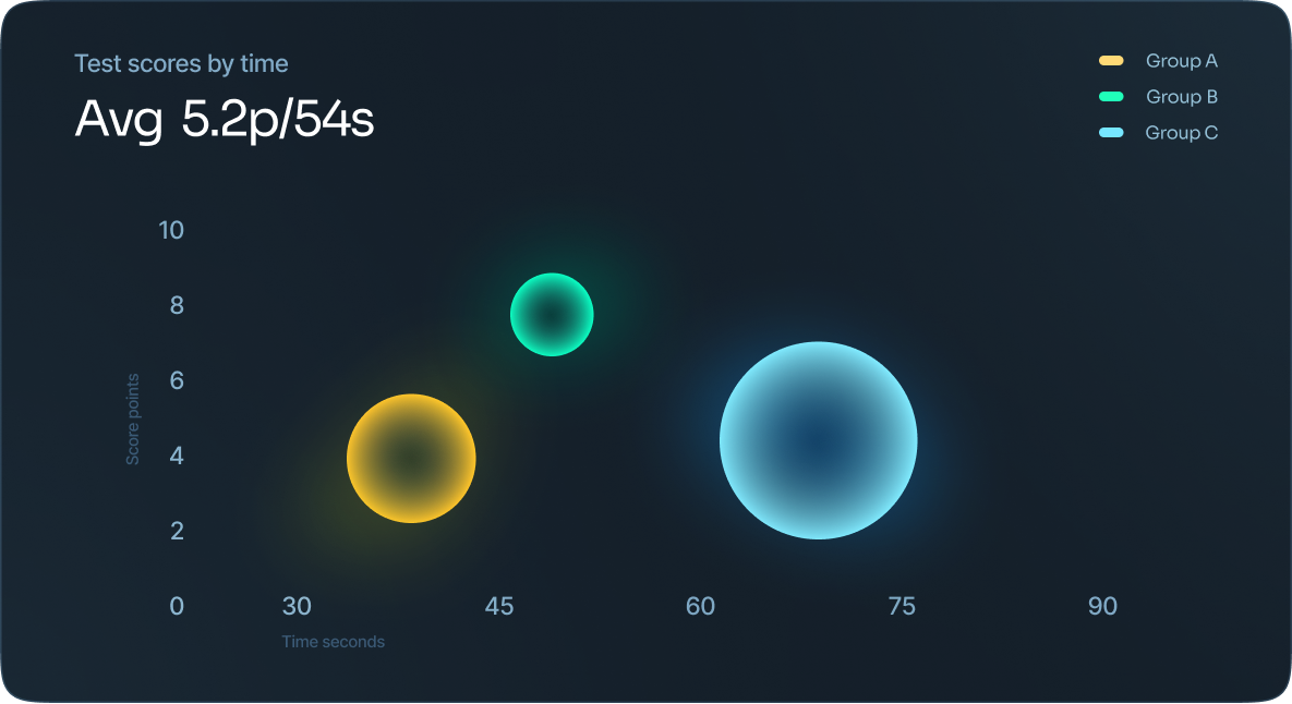
Bubble chart
A bubble chart is similar to a scatter plot, whereas each point is represented by a bubble.
Bubble charts are used to compare and show the relationship between categorized circles, based on their position on the graph and their proportion. The overall chart is used to analyze patterns and correlations in the data.
Pie chart
A pie chart is showing the many pieces that make up a single “pie” typically displayed as percentages.

Donut chart
In its simplest terms, a donut chart is a pie chart with the area in the center cut out. A donut chart puts more emphasis on the actual data, not so much the size differences between the slices. Plus, since the center is cut out, this space can be used to display additional information to the reader.

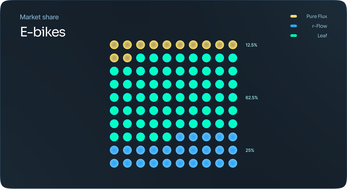
Dot martix
These are great when you need to give a quick overview of the distribution or proportion of data within a specific category within a dataset. They can also be used to visualize and compare distribution and proportion to discover patterns within data.
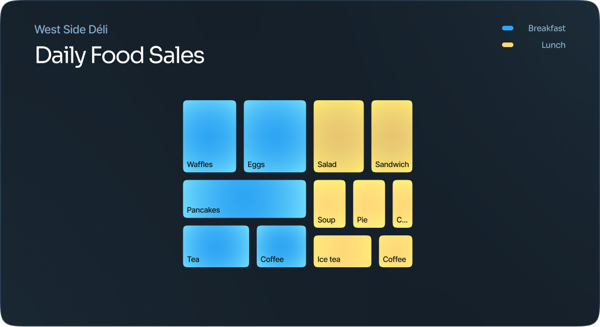
Marimekko chart
In this type of data visualization, each axis shows a scale of percentages that are used to determine the width and height of each segment that is represented by a square or rectangle. This allows viewers to see relationships between the categories. The bigger the percentage, the larger the square or rectangle within the chart.

Proportional area chart
When you need to compare values or show proportions for a quick view of the data, a proportional area chart is ideal. While any shape can be used, they typically show squares or circles.
Span chart
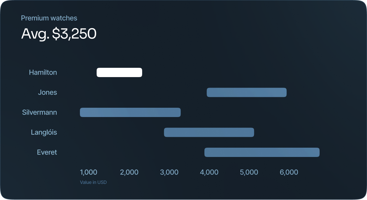
A span chart, sometimes referred to as a floating bar graph or a high-low graph, displays dataset ranges between a minimum and maximum value. These are best used when comparing ranges without needing a lot of extra data or information.
